The wonderful people at nn1.dev invited me to talk at their January meetup. Below is the video of this:
The slides are also available. But below is the blog-posty version:
Bad At CSS
I'm bad at CSS. It even says so on my GitHub profile. It hasn't always said that, as recently as 2024 I was just bad at JavaScript and HTML. It has taken me the past couple of years to get to the point where I can confidently say that I'm bad at CSS.
My journey to being bad at CSS started with me realising I didn't know enough css, and so the only responsible thing to do was to write a css parser, called csslex. It helped me understand CSS syntax. I turned that into a much bigger project called csskit, which is a fully fledged build chain for CSS. It parses, it minifies, it has an LSP stuff, it's around 500,000 lines of Rust at this point.
I also got a new job in 2025, now I'm an engineer on Firefox, so some of my time
is spent implementing new CSS features from the ground up in one of the three
major browser engines. Recently we shipped anchor positioning and I worked a bit
on that, like the implementation for anchor-center.
My point is, being bad at CSS doesn't just happen. Anyone can be mid at CSS, and there are a lot of people who are good at CSS - but those are different things. Being bad at CSS is its own skill. To be bad at CSS, you must first understand CSS.
But it's okay, because you don't have to do it the hard way, you can take the abridged route by having someone else who is bad, show you how to be bad. So let's look at some CSS.
Parsing theory tangent
If you're building a parser, you want to take a blob of text like this:
h2 {
  width: var(--width, 10px);
}
...and turn it into something useful you can reason about. You could just use a pile of regexps but you probably want to be smarter than that.
Tokenization
The first step is to tokenize, or lex. We take each set of characters and turn it into a token - identifier, punctuation, whitespace, and so on. This can be done with a small finite state machine that just looks at every character, and decides if that's part of the current token, or if we should start a new token.
[h2] [ ] [{] [ ] [width] [:] [ ] [var(] [--width] [,] [10px] [)] [ ] [}]Abstract Syntax Tree
From here we can turn this stream of tokens into a tree, and we can reason about this tree more than just text. This is typically called an Abstract Syntax Tree. CSS calls this "Component Values" and this is important because component values is an intrinsic part of the language. Notice here we can do things like matching parentheses. Unbalanced parens will make for an invalid tree.
From an AST we might start tagging or wrapping nodes in higher level nodes, which can help expose all kinds of new contexts, such as whether or not something is a selector, or a declaration. This is useful for lots of reasons - for example in selectors and custom properties whitespace matters, whereas whitespace in a block doesn't.
CSS Syntax 3
All of this is defined in a standalone spec called CSS Syntax 3. If you follow this document and implement everything it says, you'll get to the point where you have something that can parse CSS Component Values - but doesn't have smarts about what a rule is, or what's a valid selector, and so on.
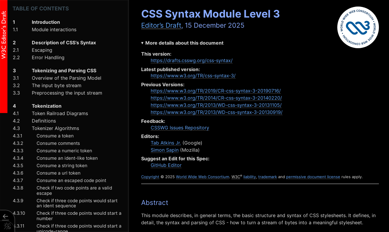
If you're really interested in this stuff, I would recommend it. You could write a parser in a language of your choosing in a weekend or two, it's very well documented.
And what you'll find in that document are a bunch of railroad diagrams. These look really intimidating but they're very informative and once you learn how to read them you'll understand exactly what characters are allowed where.
Identifiers
For example, the railroad diagram for identifiers shows that an identifier can start with a dash, or an a-z, or a group called non-ASCII, or an escape, then it must be followed by one or more a-z, 0-9, non-ASCII, or escape sequences:
This can cause some surprising things to be considered identifiers:
| Invalid | Valid |
|---|---|
4px |
px4 |
-4px |
-four-px |
-4-px |
--4px |
⁃⁃foo (unicode dashes) |
-⁸px (superscript 8 is non-ASCII) |
--⁂⁂⁂ (the "Asterism" symbol is disallowed) |
-̶̡̰̤̰̣̫̗̻̦̘͔̺̪̰̙͕̋͗̈́͗ͅ-̷̢̫̜̻͚̩̭̫̔̋̎̑͜͠z̴̧͓̪̱͈̯̗̣̖̪̼̣̱͇͓͑̓̒̽ả̴̛͓̻̖̾̑̐͂̾̈́̋͂̒̐̆̈́̄̕l̸̨̧̢͇͍̦̱͉̖̮̫̳͕̖̖̝̽̒̇͒͗́͋͐͝͝g̴̳̻̼̳̭͉͔͖͖̜̼̻̳̹͍̈́̈́̅͗̈́͋̽̀̅̑̚͜͜o̸̯̭̖̫̦̭̬̲̞̳̗̗̫͔̍͗͛̒͊͋̒̄̓̓̇̈́̈̐̚̕ (zalgo text!) |
p x (space in the middle) |
\000070 \000078 (escape sequences) |
CSS escaping rules means all of these parse the same:
h3 {
  color: red;
}
\h3 {
  color: red;
}
\68 3 {
  color: red;
}
\68 \33 {
  color: red;
}
\000068 \000033 {
  color: red;
}
Numbers
Number tokens also have similar rules, with some surprises. Here's the railroad
diagram for <number-token>:
| Invalid | Valid |
|---|---|
four (that's an identifier) |
4 |
4/2 (number, delimiter, number) |
-2.0 |
2.8.3 (two number tokens!) |
2e4 (scientific notation) |
2e4e5 (a dimension - e5 is a unit) |
+2.0000e+0002 |
CSS escaping rules means all of these parse the same:
h2 {
  width: 200px;
}
h2 {
  width: 200px;
}
h2 {
  width: 2e2px;
}
h2 {
  width: +000000000000002e2px;
}
h2 {
  width: +000000000000002e2\000070 \000078;
}
h2 {
  width: +000.0002e6\000070 \000078;
}
Token Expansion
We can take this to its logical conclusion and use a hidden feature in csskit to expand a chunk of CSS into an obfuscated mess:
npx csskit@latest expand --escape-idents -c "h2{width:200px;}"This turns h2{width:200px;} into:
\000068 \000032 {
  \000077 \000069 \000064 \000074 \000068: +2e2\000070 \000078;
}
Fun fact, in writing this, I managed to discover a bug in Firefox:
So this kind of work has its uses! And this exercise in expanding and contracting tokens is really helpful for iterating on a minifier, because it catches all kinds of issues, like csskit now has smarts about when to preserve a + sign and when to strip it out:
Real World Usage: Tailwind
Here's an example from the Tailwind docs (an apparently popular CSS framework). It uses escape characters all over the place, in order to provide a microsyntax in the class attribute:
<span class="after:content-['*'] after:ml-0.5 after:text-red-500">
  Email
</span>
The CSS for these classes is written using escapes, to allow for this kind of ergonomic syntax. The CSS however, is decidedly less ergonomic looking:
.after\:content-\[\'\*\'\]::after {
  --tw-content: "*";
  content: var(--tw-content);
}
.after\:ml-0\.5::after {
  margin-left: 0.125rem;
}
Component Values and CSS Variables
Remember how I said component values were important? If you've ever written CSS before, you've likely dealt with component values, even if you didn't realise it. That's because CSS variables are component values. The grammar, or spec, for a custom declaration is to simply save all of the token stream into the value.
--white: rgba(255 255 255 / 1);Then when you use var() you're effectively saying "insert this token stream":
color: var(--white);
/* Becomes: */
color: rgba(255 255 255 / 1);
This gives you unique capabilities, compared to other languages, as your variable can be multiple tokens, not just a value but part of what you might consider a value. For example we can do silly stuff like make two variables for 3 colors:
--rg: 255, 255;
--b: , 255;

color: rgb(var(--rg) var(--b));
/* Becomes: */
color: rgb(255, 255, 255);
CSS "Booleans"
We can use these token streams - these variables - in other expressions like
calc(). This means you can already do boolean logic:
:root {
  --condition: 0; /* or 1 */
}

.box {
  /* This would be 100px */
  width: calc(1 * 100px);

  /* This would be 0px */
  width: calc(0 * 100px);

  /* This would be either 0px or 100px */
  width: calc(var(--condition, 0) * 100px);
}
if (myCondition) {
el.style.setProperty("--condition", "1");
} else {
el.style.setProperty("--condition", "0");
}Boolean toggle in action
Your condition doesn't just have to be a boolean - you can use math to clamp it. Here's a notification dot that only shows when unread count is above 0:
.notification {
  --unread: 0;

  /* Badge only visible when --unread is > 0 */
  &::after {
    counter-reset: variable var(--unread);
    content: counter(variable);
    width: calc(min(var(--unread), 1) * 22px);
    height: calc(min(var(--unread), 1) * 22px);
    background: deepskyblue;
    border-radius: 100%;
    overflow: hidden;
  }
}
Rather than adding a class to the button when we've got notifications, we can
just give the unread count directly to CSS, and use the min function to clamp
it to either 0 or 1. We can also use the counter-reset and content rules to
actually show the number in the dot.
--unread: 0Inbox
--unread: 1Inbox
--unread: 4Inbox
Fallback Chaining
CSS variables also have fallbacks. var() takes two arguments: the first is the
name of the custom declaration, and the second is an additional token stream to
fall back to if that variable couldn't be found or if it was invalid.
Fallback values can themselves contain var() calls, letting you build a cascade
of preferences:
.card {
  /* Check multiple variables, use first valid one */
  background: var(--card-bg, var(--surface-bg, var(--default-bg, white)));

  /* Component -> Theme -> System -> Hardcoded */
  color: var(--card-text, var(--theme-text, var(--system-text, black)));
}
This is great for design systems, where you want component-level overrides, theme defaults, and system fallbacks.
The "Space Toggle" Hack
We can also use our newfound knowledge of tokens to abuse this fallback. This pattern is known as the "space toggle hack". Lea Verou has a great demonstration on her blog about this.
Because variables can be any token, this means a space is a valid value. So
--OFF encodes a single space. --ON is the value initial - a special
CSS-wide keyword that causes the value to be a guaranteed invalid value, meaning
that when you try to use it, it'll fall back to the second argument.
button {
  --OFF: ; /* Just a space - valid token! */
  --ON: initial; /* "initial" = forces fallback */
  --is-raised: var(--OFF);
  border: 1px solid var(--is-raised, rgb(0 0 0 / 0.1));
  background: var(
    --is-raised,
    /*         ON value                :  OFF value */
    linear-gradient(hsl(0 0% 100% / 0.3), transparent)
  );
  box-shadow: var(
    --is-raised,
    /*         ON value            :  OFF value     */ 0 1px
      hsl(0 0% 100% / 0.8) inset,
    0 0.1em 0.1em -0.1em rgb(0 0 0 / 0.2)
  );
}
button:hover {
  --is-raised: var(--ON);
}
When prepended to a value, the space disappears and you get your value. But "initial" makes a variable invalid, triggering the fallback chain. This gives us true if/else conditional logic in pure CSS!
Of course you could just write your CSS like a normal person:
button {
  border: 1px solid transparent;
  background: hsl(200 100% 50%);
  box-shadow: 0 0.1em 0.1em -0.1em rgb(0 0 0 / 0.2);
}
button:hover {
  border-color: rgb(0 0 0 / 0.1);
  background: linear-gradient(hsl(0 0% 100% / 0.3)) hsl(200 100% 50%);
  box-shadow: 0 1px hsl(0 0% 100% / 0.8) inset;
}
...but where's the fun in that?
Color Math with CSS Variables
Now that we know variables are powerful, let's abuse them for color math!
We can define individual color values as variables, and set the background color in CSS:
<label style="--r: 102; --g: 51; --b: 153">Purple!</label>
<label style="--r: 218; --g: 165; --b: 32">Yellow!</label>
label {
background-color: rgb(var(--r) var(--g) var(--b));
}This could let your users define the color of a background. But as you might have spotted, the contrast isn't great when the background changes.
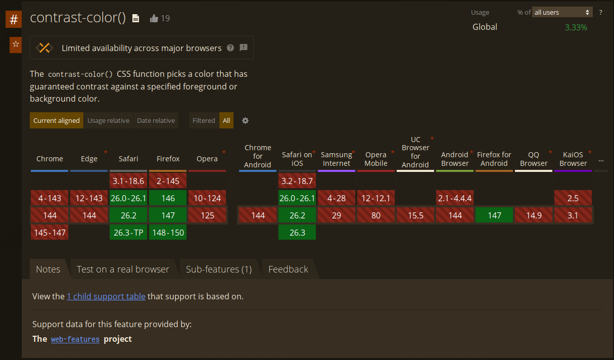
What I'd really like to do is use the contrast-color() function - but that's
not supported in Chrome or Edge right now.
Polyfilling contrast-color with calc()
We can use calc() to polyfill this:
label {
  /* Rec709 Luma coefficients */
  --luma: calc((0.2126 * var(--r)) + (0.7152 * var(--g)) + (0.0722 * var(--b)));
  --threshold: 128;
  /* Convert threshold: either 0 (black) or 255 (white) */
  --x: calc(
    255 * (1 - clamp(0, calc((var(--luma) - var(--threshold)) / 1), 1))
  );
  background-color: rgb(var(--r) var(--g) var(--b));
  color: rgb(var(--x) var(--x) var(--x));
}
We take the individual red, green and blue values, multiply them by the
Rec709 luma coefficients, add that together, and then clamp that value with a
threshold to either 0 or 255. This means the --x variable, repeated 3 times,
gives us black or white - allowing us to effectively polyfill the
contrast-color CSS function.
Real World Usage: GitHub
GitHub's label picker leverage this exact technique. --label-r, --label-g
and --label-b provide each of the RGB color channels from the user's custom
color, and the --perceived-lightness variable is the luma calculated with the
exact same Rec709 luma coefficients - 0.2126, 0.7152, 0.0722.
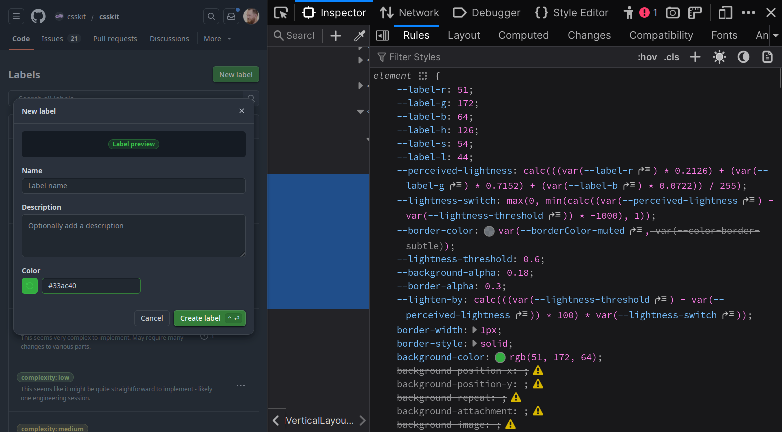
This is in production today, and has been for several years. You can go visit GitHub, open the devtools, and see this working on every label on GitHub.com.
GitHub also adds a nice additional color contrast on the font, so it's not just black nor white.
Even More Color Math (100% Less Useful!)
So let's do that! What if we took our input colors, and instead of deriving Luma, we linearized them?
/* Linearize sRGB to Linear-RGB */
--rt: clamp(0, sign(calc(var(--rs) - 0.04045)), 1);
--gt: clamp(0, sign(calc(var(--gs) - 0.04045)), 1);
--bt: clamp(0, sign(calc(var(--bs) - 0.04045)), 1);
--rl: calc(
  (1 - var(--rt)) * (var(--rs) / 12.92) + var(--rt) *
    pow(calc((var(--rs) + 0.055) / 1.055), 2.4)
);
--gl: calc(
  (1 - var(--gt)) * (var(--gs) / 12.92) + var(--gt) *
    pow(calc((var(--gs) + 0.055) / 1.055), 2.4)
);
--bl: calc(
  (1 - var(--bt)) * (var(--bs) / 12.92) + var(--bt) *
    pow(calc((var(--bs) + 0.055) / 1.055), 2.4)
);
Then we apply some matrix math to get the LMS color space values:
/* Convert LinearRGB to a generic LMS (Long, Medium, Short) color space */
--l: calc(
  0.4122214708 * var(--rl) + 0.5363325363 * var(--gl) + 0.0514459929 * var(--bl)
);
--m: calc(
  0.2119034982 * var(--rl) + 0.6806995451 * var(--gl) + 0.1073969566 * var(--bl)
);
--s: calc(
  0.0883024619 * var(--rl) + 0.2817188376 * var(--gl) + 0.6299787005 * var(--bl)
);
--lp: pow(var(--l), 0.3333333333333333);
--mp: pow(var(--m), 0.3333333333333333);
--sp: pow(var(--s), 0.3333333333333333);
And from there we do some more matrix math to get the OKlab values:
/* Convert LMS to Oklab (L, a, b) */
--okl: calc(
  0.2104542553 * var(--lp) + 0.793617785 * var(--mp) - 0.0040720468 * var(--sp)
);
--oka: calc(
  1.9779984951 * var(--lp) - 2.428592205 * var(--mp) + 0.4505937099 * var(--sp)
);
--okb: calc(
  0.0259040371 * var(--lp) + 0.7827717662 * var(--mp) - 0.808675766 * var(--sp)
);

/* Oklab to Oklch: C = sqrt(a^2+b^2), h = atan2(b, a) */
--okc: sqrt(calc(var(--oka) * var(--oka) + var(--okb) * var(--okb)));
--okh: atan2(var(--okb), var(--oka));

/* Final Oklch color declaration */
--oklch: oklch(var(--okl) var(--okc) var(--okh));
Then determine if the Luminance Value was light or not, using the same techniques we've seen throughout this, calculating an alternate lightness:
/* BOOLEAN: determine if the Luminance Value was light or not */
--is-light: clamp(0, calc((var(--okl) - 0.5) * 1000), 1);
--dir: calc(1 - 2 * var(--is-light));

/* Calculate the alternate Lightness for Oklch */
--okl-alt: clamp(0, calc(var(--okl) + var(--dir) * 0.55), 1);
--oklch-alt: oklch(var(--okl-alt) var(--okc) var(--okh));
And finally:
label {
  background: var(--oklch);
  color: var(--oklch-alt);
}Is this useful? Probably not. But it demonstrates just how ridiculous CSS can be if you try hard.